Cover and interior designed by people who design for bookstores, not templates.
Designed together, so the cover and the pages agree with each other.
A distinctive front, spine and back, designed around your book.
Readable typography, spacing, chapter styling and page structure.
Artwork placed naturally inside the reading experience.
The same visual system, rebuilt for a reflowable edition.
Readers meet your book as a tiny image on a screen, then hold it as an object. It has to work in both.
Fiction, nonfiction, memoir and illustrated titles each get their own typographic treatment. The design serves the reading experience the genre needs.
Quiet typography. Comfortable rhythm. Clear chapter openings.
Clear hierarchy, callouts and tables that guide the reader.
Warm pages with room for photographs and captions.
Artwork and text composed together, spread by spread.
Genre, audience, references, tone.
The first visual concepts, side by side.
Typography, imagery, layout, your feedback.
Files prepared for the formats you are publishing.
Six variables that change the final file. None of them set generically.
Chosen with the printer and the genre in mind.
Set per platform, never guessed.
Calculated from page count and paper stock.
300 DPI minimum on every print asset.
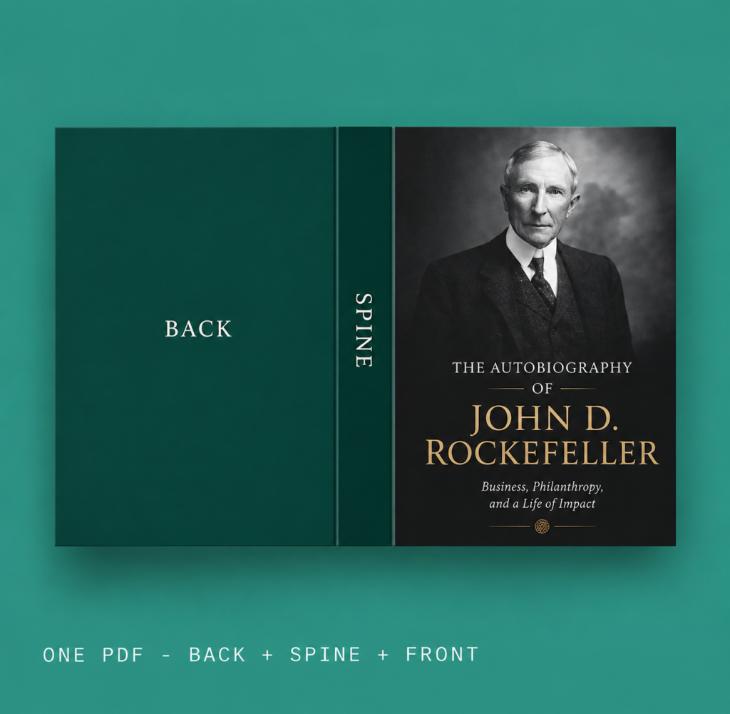
Front, spine and back as a single print-ready PDF.
Reflowable, and device-tested separately.
Front, spine and back in one PDF
Typeset pages, print-ready
Sized for every store listing
Named and packaged per platform
 THUMBNAILEBOOKPAPERBACK
 THUMBNAILEBOOKPAPERBACK